Willis Towers Watson HR Portal
The Challenge
Companies need a centralized way communicate to their employees. Employees need a way to find information about their benefits, org policies, events, and general happenings. The people most likely to create and manage this content were HR Professionals, who were also the least likely to have advanced coding skills. We had to provide a content management system was intuitive. It would also provide just the right level of personalization to reflect the voice of the company while ensuring the integrity of branding, layout, and perhaps most importantly, color usage for accessibility.

The Process
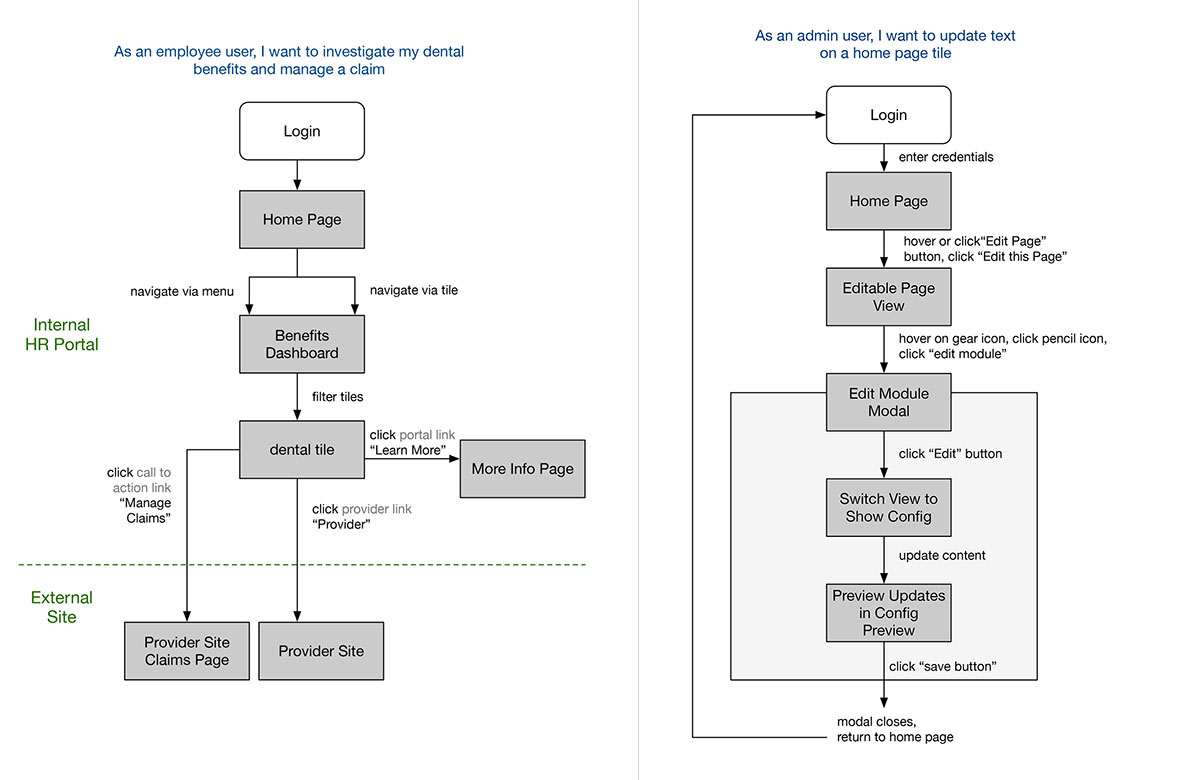
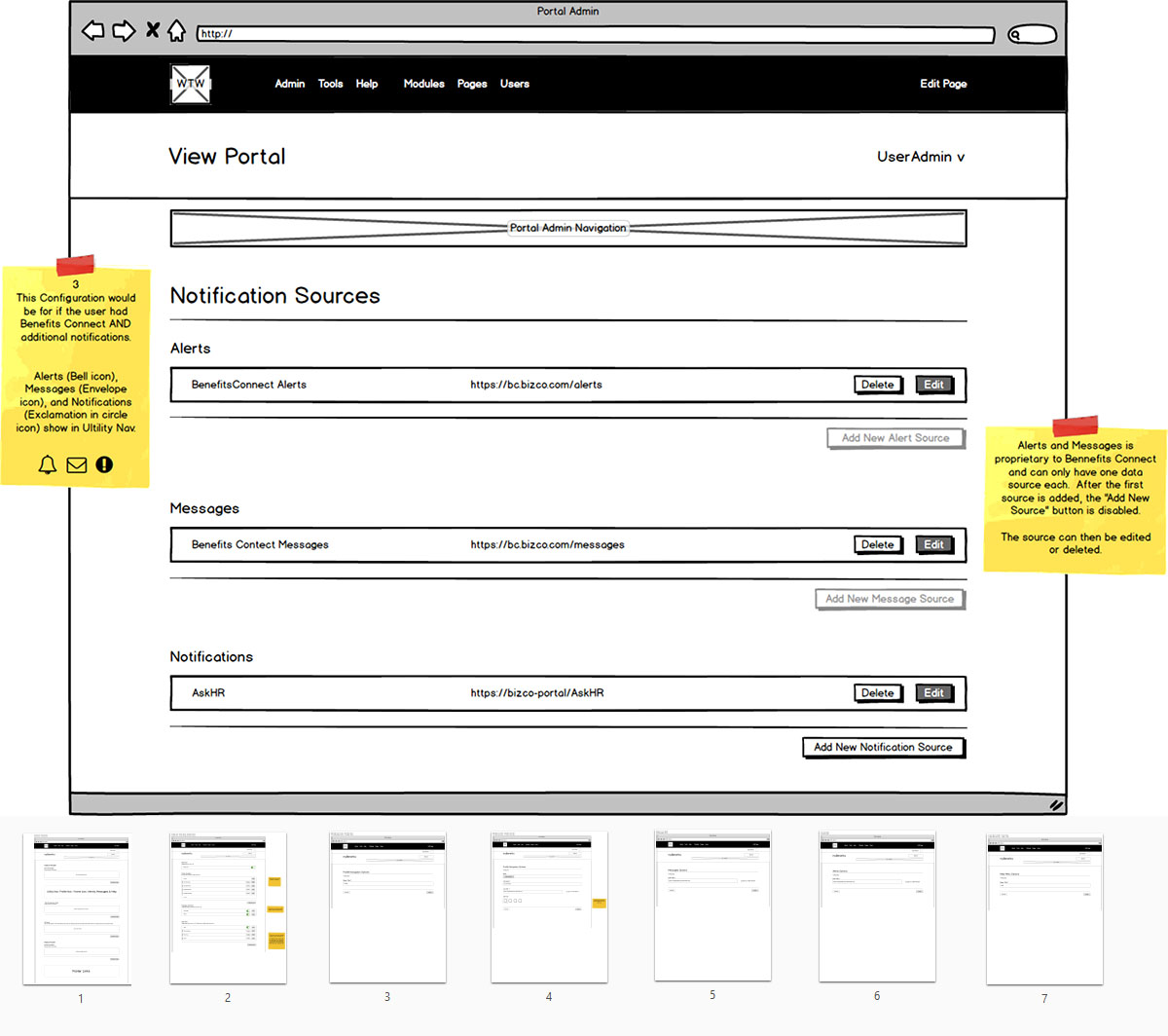
I spent a good amount of time collaborating with and mentoring our other team designer who was less experienced. We tackled information architecture, workflows, and creative ways to incorporate dynamic design variations between themes. I introduced wire-framing as a practice, boiling down elaborate UIs into a logical, step-by-step strategy. I also started a content inventory so every time we developed a new theme, we could ensure all our modules were covered. My design partner and I poured over findings from our research team, had an active role in modifying CSS and angular components, and provided UX and technical documentation around each module.

Translating Analysis to Design
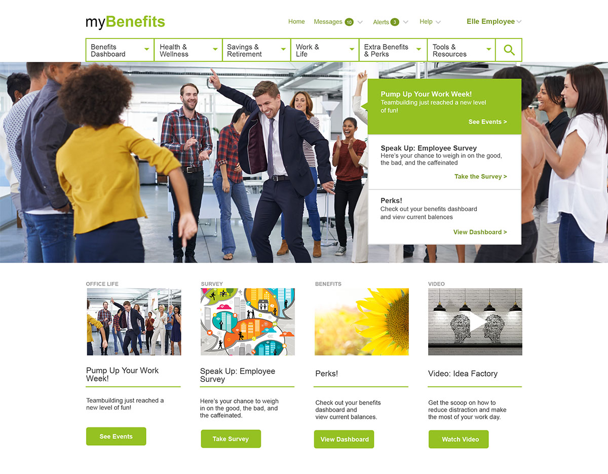
We established some defaults around theming, like every theme has a primary, secondary, and tertiary color - this would support companies looking to match brand colors. Text color was limited to light on dark or dark on light - the system had built-in accessibility checks to ensure standards were upheld. I created high fidelity mocks to place in front of real customers for feedback. A couple things came to light:
- There was a need for a responsive experience to cater to company employees who work in the field on mobile devices instead of (assumed) desktop computers.
- It was important to users to be able to choose between vertical or horizontal navigation.
- Users gravitated strongly either towards a traditional layout (modeled to a very straight-forward enterprise app feel) or towards a very dynamic layout (modeled towards a journalistic-like layout with lots of texture and imagery.

Delivery and Outcome
Our team implemented several new features that got our customers excited about upgrading their product to the new version. I contributed to the development by providing wire-frames and front-end dev support for styling and HTML layout. High fidelity mocks helped to model what was possible with the interface we created, laying the groundwork for our theme system. The thought that went into creating a consistent experience in the backend translated to our users being able to succussfully create an avenue for internal communication on the front end.

